project overview
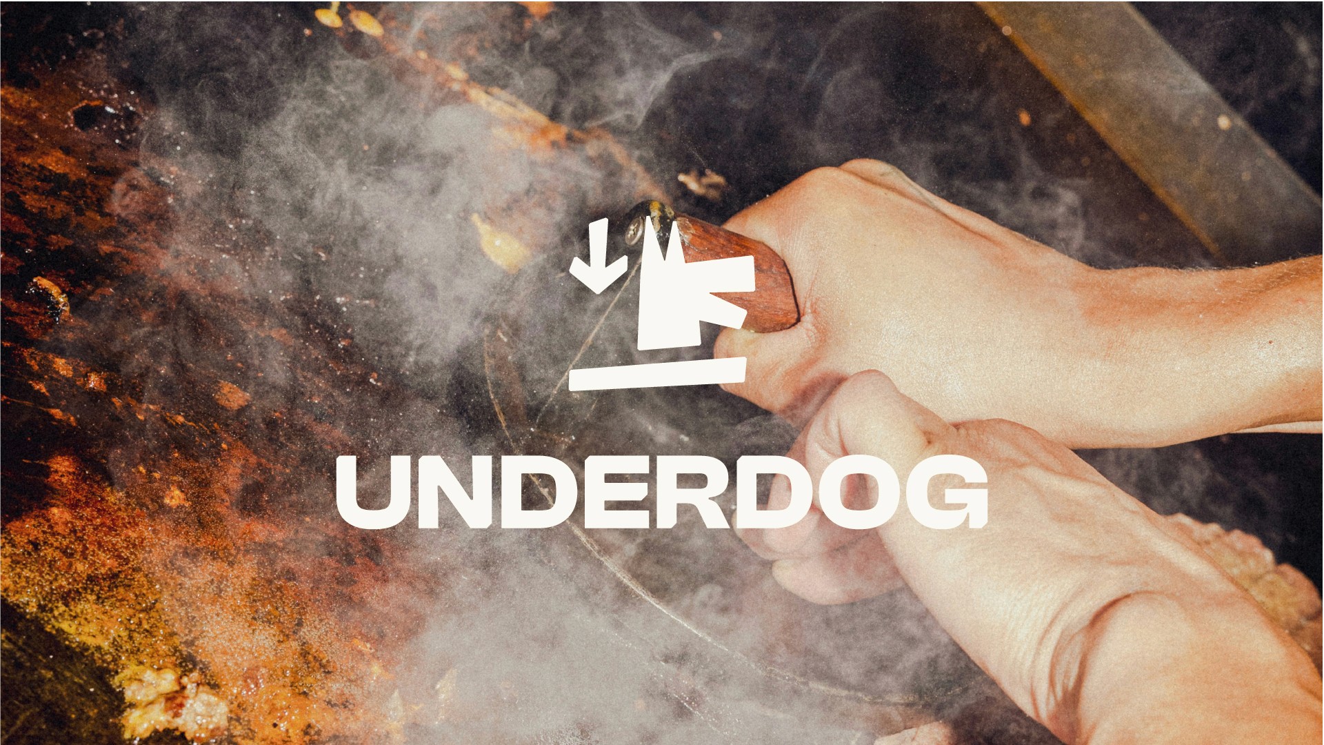
Effortlessly juicy, from Down Under. A self-directed concept project exploring what a burger brand identity could look like at the intersection of graffiti art and fast-food nostalgia.
project type
Brand Design
year
2024
my role
Brand Designer, Art Director
client
Underdog
The Problem
Standing out in a crowded market usually means shouting louder. The brief I set for myself was the opposite: an identity that feels effortless yet instantly recognizable, speaking to people who want great food without the pretension.
Nodding to Haring
The logomark draws inspiration from Keith Haring's instantly recognizable dog figures, not a reproduction, but a study in his energy. Hand-drawn to channel that same sense of character. Blending that playful, graffiti-style spirit with a nod to nostalgia, the mark captures grit and personality in a single gesture.
The System
Typography leans bold and punchy, full-flavour attitude of the food. A palette of high-contrast tones and vibrant pops keeps things engaging, while packaging and signage bring in street art elements and cheeky messaging. Every touchpoint reinforces the same easygoing, rebellious charm, the identity doesn't just sit on a wall or a menu, it invites people in.
The result is bold, unapologetic, and effortlessly cool, a concept built to hold its own space in the European burger scene without ever looking like it's trying to.


