project overview
A brand identity for a fresh pasta shop sold by weight. No packaging, no shelf life, just the product itself.
project type
Branding, Identity Design
year
2020
my role
Lead Designer, Brand Designer
client
Grammi
The Problem
Selling by weight is an old world retail model with a modern problem: it only works if people trust what they're buying before they've tasted it. There's no packaging to design a story onto, no label to carry the brand. The identity had to do that work somewhere else entirely.
The Saucetrap
The idea that carries the identity came from the smallest possible detail, one that maybe just Italians might notice. Right, the typeface the identity is built around, uses inktraps: technical tiny notches cut into letterforms so ink doesn't bleed when printed in small sizes. But if you look at them next to a piece of rigatoni, you suddenly realize that beautifully designed piece of pasta carries the same logic. A texture built to hold onto a sauce, a proper saucetrap.
If typography and pasta can behave the same, it was a concept worth exploring.
Where It Lives
With no standard packaging to carry the brand, the identity had to show up everywhere else instead. It lives as a stamp marking bags and boxes, and it extends into the shop's secondary products, the oils and sauces sold alongside the pasta.
The System
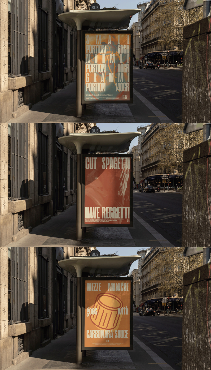
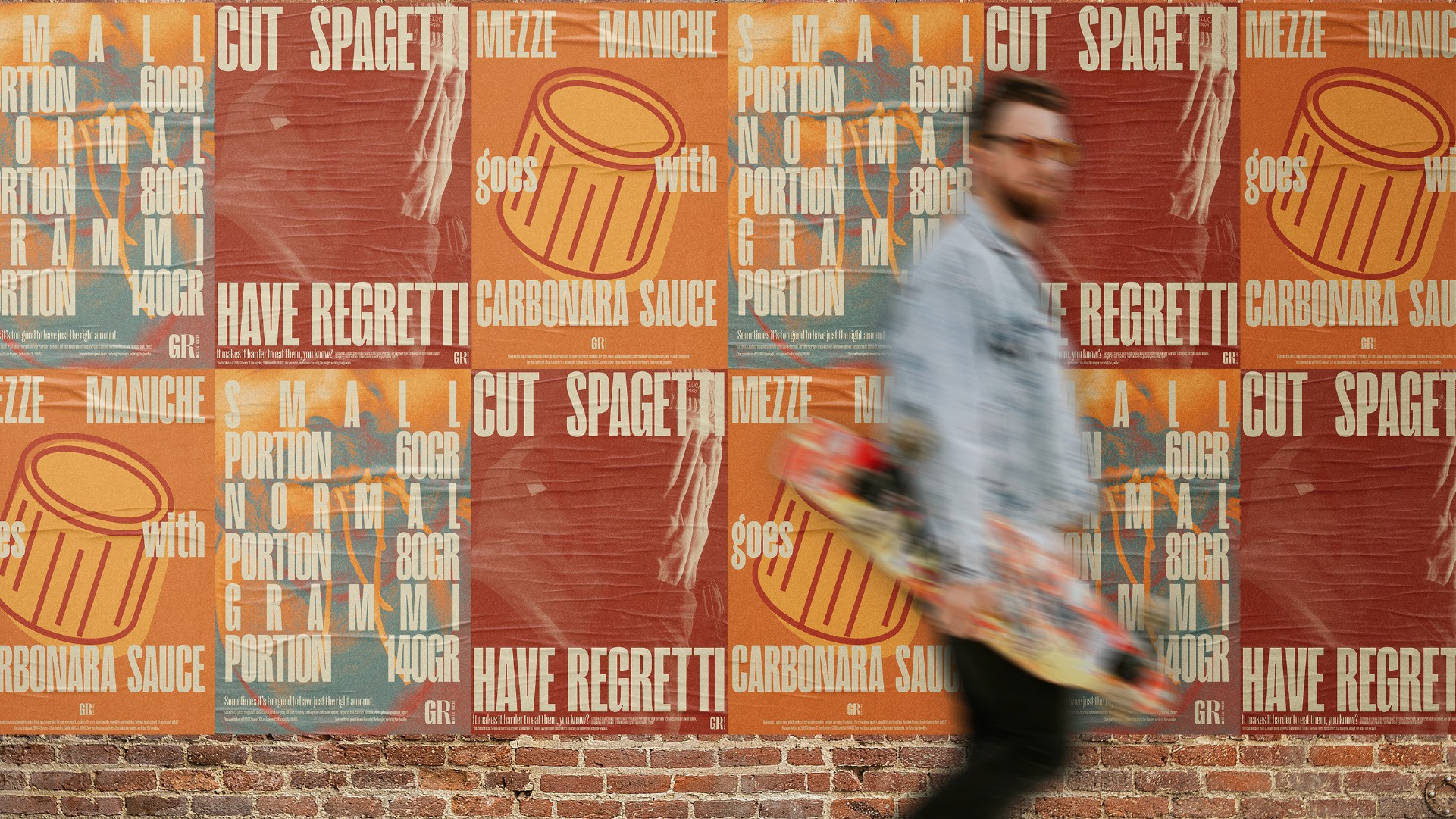
That same logic, texture built to hold onto something, runs through the rest of the identity too. Grammi's identity carries both a handmade feeling and the rigor of a modern minimal identity. The playfulness of the illustrations matches the handmade nature of the pasta, and it's not carried just through visuals. The verbal identity is equally playful and sharp, often playing with Italian stereotypes that are still universally understandable.
For the logo, the font Right provides a more rigid tone. But the playfulness comes out in the mix and match of font weight and styles, creating a visual ensemble that resonates with the variety of shapes and sizes of handmade pasta.