project overview
An identity for an artist whose work needed one clear signature.
project type
Brand Identity
year
2026
my role
Brand Designer
client
Emma Lopes Art
The Problem
Emma Lopes is a painter based in Ericeira, working at the edge of Portugal and the Atlantic, with nature as her constant reference. She already had a real practice and real collaborations with environmental NGOs, but her presence, especially in the international art market, was scattered: voice unclear, messaging confused, her online store dispersive. The problem wasn't a lack of substance. It was a lack of a recognizable thread tying it together.
The Stamp
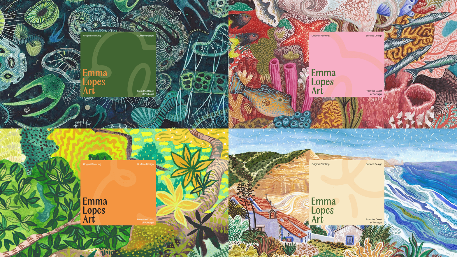
The mark does that work on its own. Built from a single continuous line, in the spirit of Japanese hanko stamps, the logo functions as an actual stamp. Something she can apply directly onto her paintings to mark them as hers. Inside that same shape sits a plant form that, looked at differently, reads as her initials, EL. One mark carrying nature, authorship, and identity all at once, functioning less like a logo and more like a signature.
The System
Everything else in the identity was built to stay quiet enough for that mark to lead. The palette is pulled directly from the tones she uses most in her own paintings, so the brand isn't referencing her work from the outside. Professional enough to hold up internationally, warm enough to still feel hers.